Exploring the Power of CSS Animation: Enhancing User Experience💪🖥😍

"A CSS animation lets an element gradually transition from one style to another."
It is well known that CSS can be used to design and beautify a webpage, but its power goes beyond that. CSS allows us to animate HTML elements without the use of JavaScript.
Keyframes
Keyframes contain the styles an element would possess at a certain time. The animation works by gradually changing the current style of the element to a new style at the specified time. You can change different styles like colour, width, height, position, etc

Animation short-hand property

| Animation Property Values | Function |
| animation-name | specifies the name of the keyframe |
| animation-duration | specifies how long it would take to complete the animation |
| animation-timing-function | specifies the speed of the amination |
| animation-delay | specifies the time to wait before the animation starts |
| animation-iteration-count | specifies the number of times the animation would play |
| animation-direction | specifies whether the animation is played forward, backwards or alternate. |
Animation-timing-function
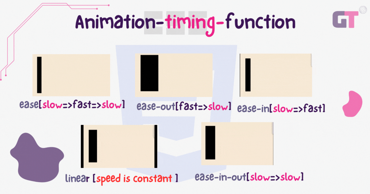
-Ease: The animation starts slow and then becomes fast before it ends slow.
-Ease-out: The animation starts fast and ends slow.
-Ease-in: The animation starts slow and ends fast.
-Linear: The speed of the animation is constant.
-Ease-in-out: The animation starts slow and ends slow.
Project: Floating squares
This is a fun and easy project to practice and play around with CSS animations
Step 1: Create two div, with id's "square1" and "square2".
 <div id="square1"></div>
    <div id="square2"></div>
Step 2: In your CSS file, specify the height, width and position of your squares. Ensure the position is set to absolute.
#square1{
    width: 70px;
    margin-right: 20px;
    left: 800px;
    height: 70px;
    position: absolute;
    top: 240px;
}

#square2{
    width: 70px;
    margin-right: 20px;
    left: 400px;
    height: 70px;
    position: absolute;
    top: 230px;
}
Step 3: Create your keyframe, and change the values of the left and top attributes, and also the background colour.
@keyframes float1{
    0%{left:1000px;
        top: 250px;
    background-color: red;
}
    30%{left: 800px;
        top: 200px;
    background-color: orange;}
    70%{left: 500px;
        top: 300px;
    background-color: yellow;}
    100%{left: 380px;
        top: 350px;
    background-color: green;}
}
@keyframes float2{
    0%{left:900px;
        top: 300px;
    background-color: blue;}
    30%{left: 750px;
        top: 150px;
    background-color: indigo;}
    70%{left: 600px;
        top: 250px;
    background-color: violet;}
    100%{left: 380px;
        top: 300px;
    background-color: teal;}
}
Step 4: Add the animation property to your squares. Then you are done!
.square{
    width: 70px;
    margin-right: 20px;
    left: 800px;

    height: 70px;
    position: absolute;
    top: 240px;
    animation: 5s linear 0.2s infinite  float1;
}

.square2{
    width: 70px;
    margin-right: 20px;
    left: 400px;
       background-color: red;
    height: 70px;
    position: absolute;
    top: 230px;
    animation: 5s linear 0.2s infinite  float2;
}

Thanks for reading!!, Please don't forget to like, share, follow and comment :)


